Overview
Toast provided a comprehensive rollout of visual materials for Canopy Healthcare, Canopy Imaging, and Canopy Cancer Care. While the core brand mark was already in place, we were tasked with evolving the brand to to carry seamlessly across everything from clinic signage to digital platforms, and even a custom-designed MRI “caravan”, evoking the iconic Kiwi bach and contributing to a relaxed, at-ease patient experience.


Services Delivered
- Brand Application & Rollout
- Signage & Wayfinding
- Print & Digital Design
- Motion Graphics
- Environmental & Spatial Design
- Patient Experience Solutions
The Challenge
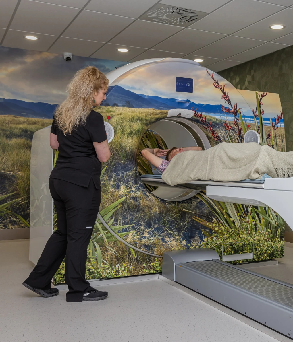
Canopy Cancer Care’s mission is deeply human: to provide world-class cancer care in a way that feels personal, calm, and reassuring. In addition, Canopy Imaging is focussed on providing patient-centric medical imaging.
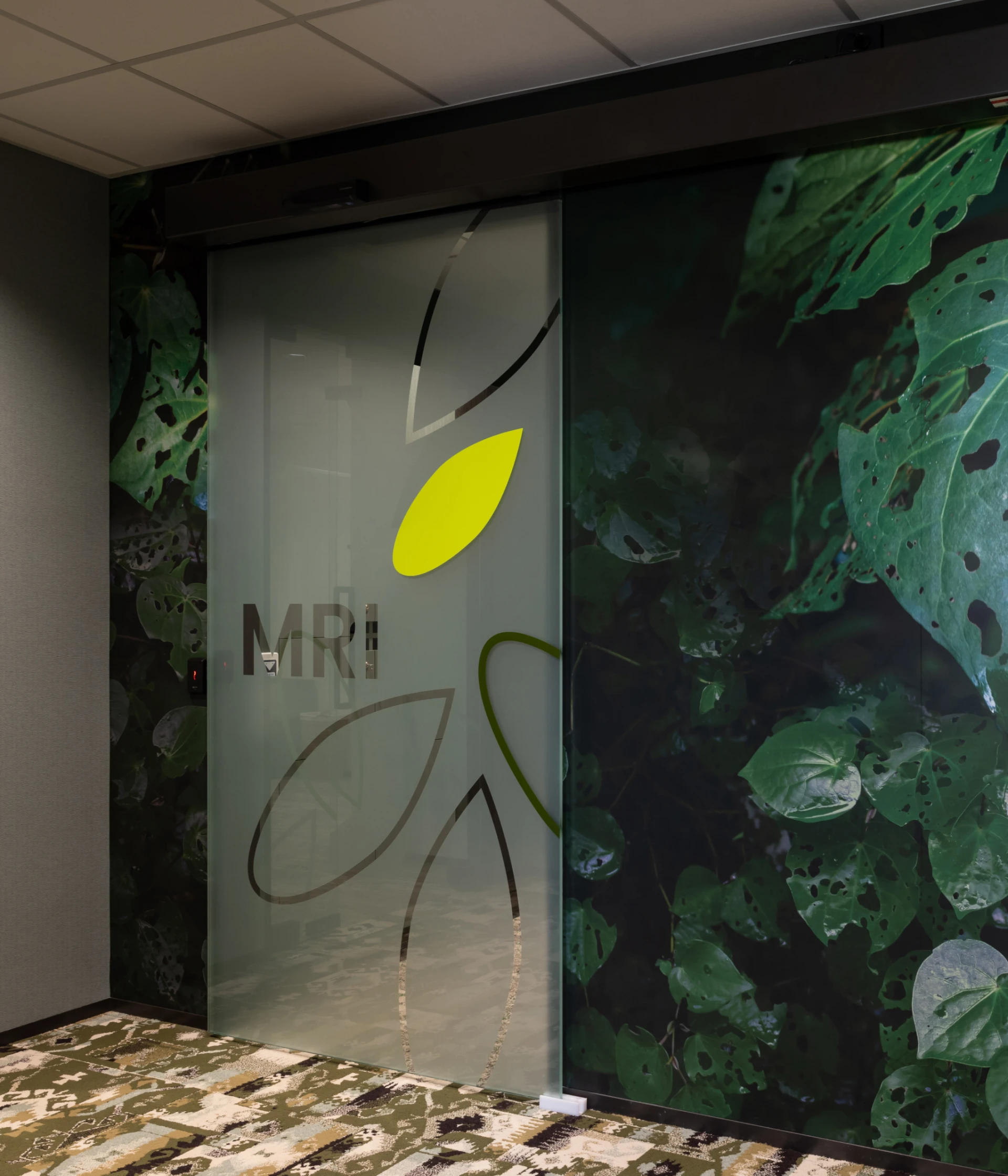
Our task was to take the proposed new Canopy Healthcare logo and build a visual language that would work across physical spaces, digital platforms, and clinical environments, and represent Canopy’s core principles. Healthcare spaces can often feel clinical and intimidating. Our job was to make sure every design element reflected that intent, and that everything worked together to build trust from the moment someone walked through the door.
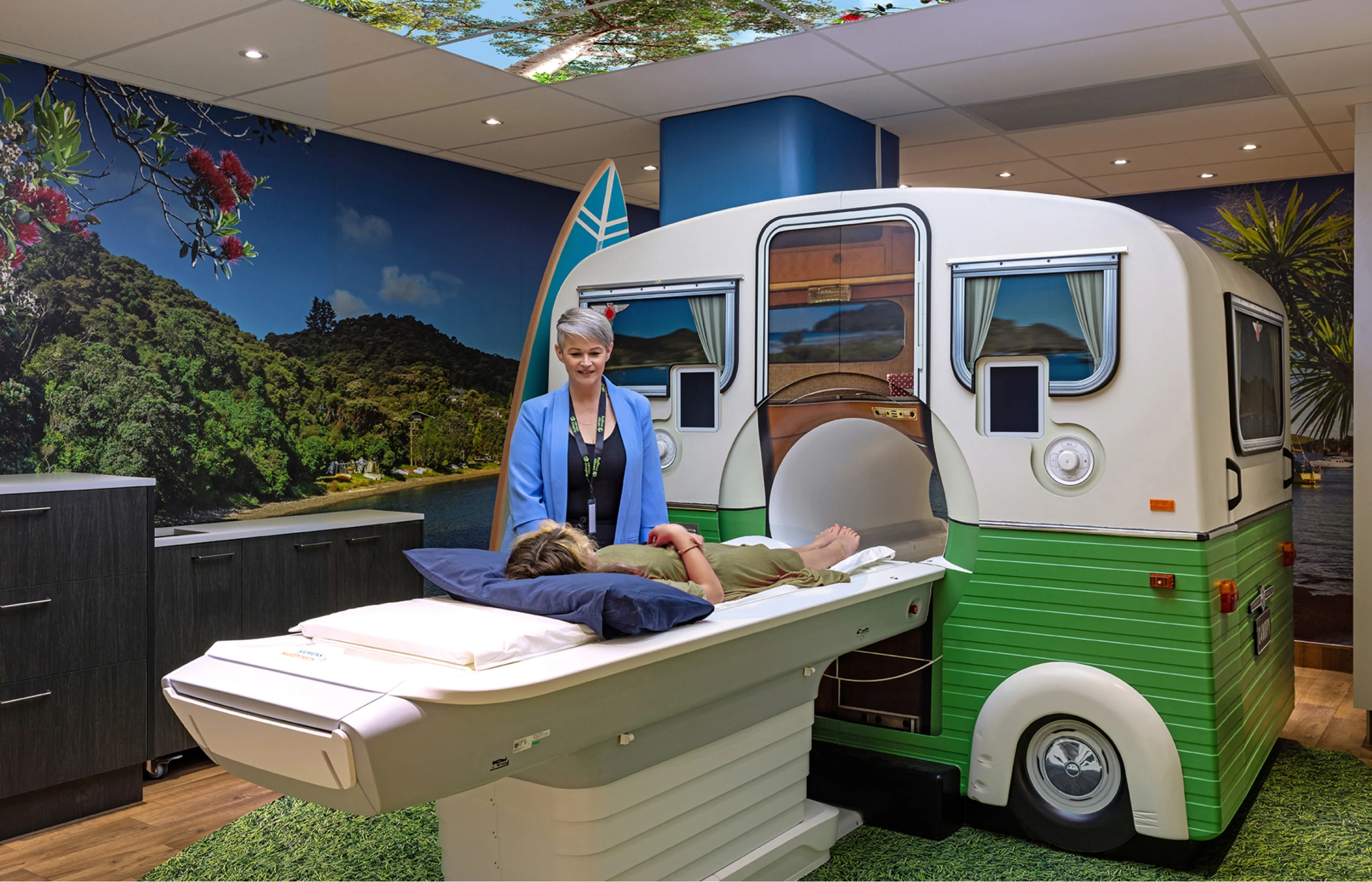
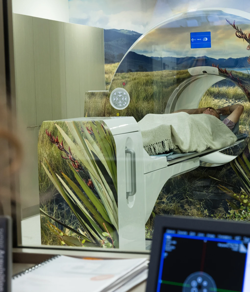
Designing with a Kiwi Lens: The MRI Caravan Surround
One of the standout features of this project was designing a surround for an MRI machine in the shape of the classic Kiwi caravan. Knowing how intimidating MRIs can be, this playful, retro-inspired structure evokes a uniquely Kiwi approach and is a nod to the classic Kiwi holiday, bringing a sense of familiarity into the clinical space.
It’s an innovative, yet simple and empathetic design choice that helps patients - especially younger one - feel more at ease during the scan process.

Our Approach
Toast developed a holistic brand rollout bringing Canopy’s values to life:
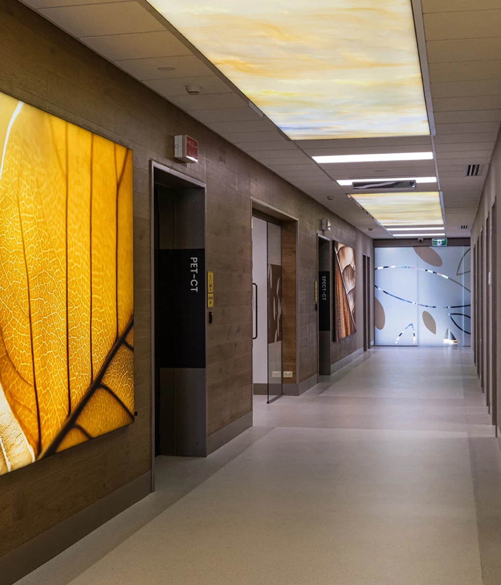
- Custom-designed wayfinding and identity signage for clinics and imaging suites, balancing clarity and warmth in every detail.
-
Patient-first design for brochures, forms, information packs, and more—streamlined for usability and tone of voice.
-
Branded Blunt umbrellas to corporate promotional swag bags
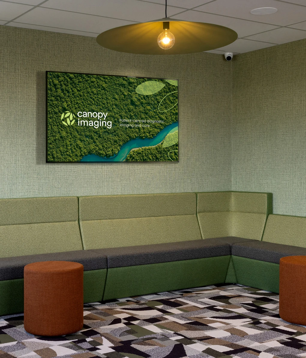
- Motion design and ambient content tailored for clinic displays, helping patients feel informed and supported.
- Feature light installations that elevate clinic interiors, adding a soft, comforting glow while reinforcing the brand palette.

Digital Development
Visual and UX enhancements for Canopy’s digital footprint, ensuring accessibility, consistency, and alignment with the broader brand.
The Result
Toast helped take Canopy’s visual identity and roll it out in a way that feels consistent, considered, and deeply aligned with their values. From clinic signage to caravan surrounds, the brand now lives across a wide ecosystem—supporting a better experience for every New Zealander who interacts with it.
Looking to evolve your brand into something people can feel—not just see? Let’s talk!